Credit card logos for your website checkout: Rules and best practices
Industry
Updated 13 Nov 2026
7 min

Anton Tsyslytskyi
Product Manager, Solidgate
Shoppers hesitate when they can’t tell which cards you accept. Learn where to place payment logos, what each brand requires, and how to keep your files current.
Your customer is ready to buy. Their cart is full, details entered, plan selected, and order double-checked. But when they reach the payment step, something feels off.
“Does this site accept my card? Is my payment secure? Can I pay with PayPal?” Instead of taking the risk, they abandon the checkout. The sale is lost.
Credit card logos for your website checkout are trust signals. They tell your customer that you accept their preferred payment method and that you process their transaction securely. Without them, you risk losing more than a sale – you risk losing credibility.
Logos also serve a compliance function, because card schemes and (APMs) have strict requirements for displaying them.
At Solidgate, we’ve helped merchants set up checkouts that convert and stay compliant. This guide walks through brand rules, placement, and upkeep, so your credit card logos stay correct and your checkout keeps converting.
TL;DR
- Payment logos are trust signals and a compliance requirement in one. Baymard found that 19% of shoppers who abandon an order don’t trust the site with their card details.
- The major brands set their own display rules. Visa marks must be in Visa Blue, Mastercard artwork can’t be altered, and Apple Pay marks can change in height only.
- We recommend placing logos near the card fields, ideally above or beside them. Apple Pay and Google Pay buttons should be at least as large as your other payment buttons.
- Localize: BLIK in Poland, Pix in Brazil, UPI in India, iDEAL | Wero in the Netherlands. Region-specific logos next to major card brands can lift conversion with global audiences.
- Keep assets current. Source logos only from official brand centers, prefer SVG, and check for updates at least annually.
Logos matter for checkout experience
When customers see the logos of trusted payment providers, they feel more confident completing their purchase.
of abandonment reasons found that 19% of shoppers who , excluding those just browsing, didn’t trust the site with their card details. A well-placed set of recognizable payment logos can reduce hesitation and improve conversion rates.
Logos are also a compliance requirement. Card networks and payment methods enforce strict branding guidelines, and breaking them can bring warnings or even restrictions on .
Core insight: Logos matter at checkout because they help hesitant shoppers trust the payment step and keep you inside brand rules that can otherwise restrict processing.
Rules behind card and APM logos
The Visa and Mastercard set display rules for merchant websites and apps, and Mastercard allows a narrow exception for some US locations.
Visa: Online merchants that accept Visa must display the Visa Brand Mark on their websites and apps in solid, vibrant Visa Blue. Take the mark from Visa’s own files, so the color stays exact.
Mastercard: Use only Mastercard artwork, unaltered, with the Symbol in full color. Show it at parity with your other acceptance marks – same size, prominence, and position.
Apple Pay: Use only the artwork Apple provides, with no changes other than height. Set that height equal to or larger than your other payment marks. The Apple Pay button is a separate element: make it no smaller than your other payment buttons, and don’t show it on devices that don’t support Apple Pay.
Google Pay: Use only the mark Google provides, without altering it. Keep clear space of at least half the height of the capital G on all sides, and make the mark no smaller than your other brand marks.
PayPal, Amex, and Discover: Use the official files. Get the PayPal button and logo from the PayPal logo center. Get the Amex and Discover marks from their signage pages.
A common mistake we see is using outdated or modified logos. Stretched, recolored, or low-quality versions add friction and can raise compliance issues with .
Core insight: Each brand sets its own display rules, and all of them start with using the official artwork as supplied. In practice that means Visa Blue, unaltered Mastercard artwork at parity, height-only changes for Apple Pay, and clear space for Google Pay.
Credit card logos for website: Where to get official files
Source payment logos and branding requirements directly from each provider’s official website. The links below cover the most commonly used card brands and APMs, so your “accept all major credit cards” logo strip uses current, approved files:
Credit card brand logos
Mastercard:
Amex:
Discover:
Digital wallet logos
Google Pay:
AliPay:
Local payment method logos
Klarna:
BLIK:
iDEAL | Wero:
iDEAL is moving to Wero. According to , the co-branded iDEAL | Wero logo has been appearing at checkout since early 2026, and the move to Wero happens in stages.
Use the downloaded files exactly as each brand supplies them. Resize only as the guidelines allow, and check each brand’s minimum size and clear space rules before shrinking a logo for mobile.
Core insight: Official logo files and brand standards sit on each brand’s own pages, so a logo strip built from those links stays current and approved.
Best practices for logos at checkout
Placement matters
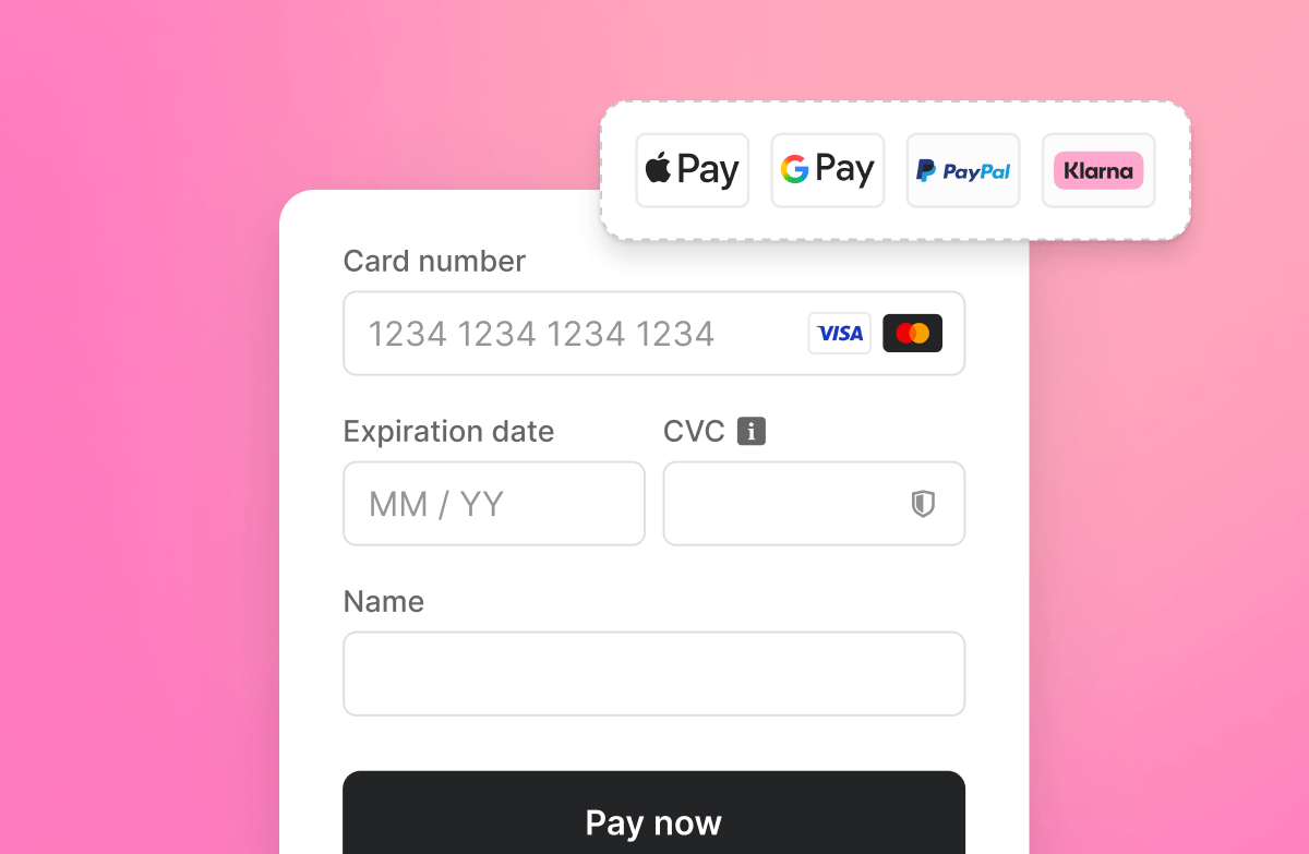
Put credit card logos where users expect to see them – typically near the . You can repeat them in the footer as a secondary trust signal.
For desktop website checkouts:
- Keep logos close to the credit card fields, ideally above or beside them.
- Keep them clearly visible without overwhelming the form.
For mobile checkouts:
- Use responsive images so logos display correctly across screen sizes.
- Avoid excessive white space, which can make the design feel disjointed.
- Display Apple Pay and Google Pay wallet buttons prominently, at least as large as your other payment buttons, for one-tap checkout on mobile devices.
Here’s an example of a desktop checkout:

Localization matters
Credit card and major digital wallet logos are only one piece of a modern checkout experience, because payment expectations vary by region. In Poland, customers look for BLIK. In the Netherlands, they look for iDEAL | Wero,and in Brazil, for Pix, and in India for UPI.
If you sell to a global audience, show region-specific payment methods alongside major card brands and digital wallets. Give those payment method logos the same care as your card logos, so the whole checkout looks consistent and trustworthy.
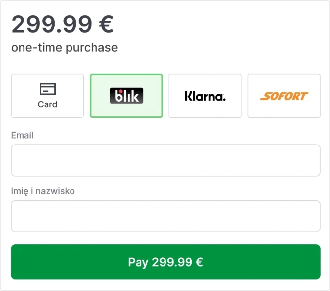
At , we work with merchants to refine checkout flows and keep payment integrations compliant.
Handling logo updates
Card networks periodically update their branding. The move from iDEAL to the co-branded iDEAL | Wero logo is a current example. Schedule periodic checks so you’re using the latest versions of your payment logos. If your payment service provider (PSP) doesn’t update them automatically, add the check to your routine site maintenance.
To stay compliant and ensure consistency, check for updates at least annually or as part of your quarterly site maintenance.
A quick audit covers four points: every file comes from the brand’s own page, no logo has been stretched or recolored, marks and buttons follow the size rules above, and each logo renders on desktop and mobile. Run it after any checkout redesign, since redesigns are when logos get resized or swapped.
Technical guidelines for implementation
Logos that fail to display often trace back to incorrect file paths, caching problems, or improper formatting. Follow these practices to avoid them.
Centralize logo storage. Maintain a single source of truth for all payment logos so you can update them in one place. Avoid embedding them in multiple areas of your codebase.
Load logos fast. Cache logos to reduce load times.
Use clear and consistent naming. Name files descriptively, like visa-logo.svg or apple-pay-badge.svg. Hash-based names hide which logo is which.
Prefer SVG format. SVG files maintain quality at any size and load faster than PNGs or JPGs.
Make logos accessible. Give each logo alt text that names the brand, such as “Visa” or “Apple Pay”, so screen readers announce which methods you accept.
Dynamically load logos. Use API-driven solutions to display only the logos for the payment methods you offer.
At Solidgate, we help businesses integrate payment logos and automate updates, so the stays consistent as brand requirements change.
Acceptance marks vs. security badges
Acceptance marks and security marks tell shoppers two different things. Acceptance marks, such as the Visa and Mastercard marks covered above, show which cards you take. Security marks, such as Visa Secure and Mastercard Identity Check, show that the payment is authenticated through . A checkout can carry both kinds, since one answers whether the card will work and the other whether the payment is protected.
Core insight: A trustworthy checkout puts logos near the card fields, shows local methods for each region, and serves current SVG files from one central place. It also tells shoppers which cards you accept and that the payment is authenticated.
Give customers confidence to pay
Displaying card brand logos correctly is a small step that can . It reassures customers, supports conversion, and keeps you compliant with card scheme rules. To get it right:
- Use official logos from card network resources
- Position them where users expect to see them
- Follow branding guidelines to stay compliant
- Update assets whenever brand requirements change
Solidgate’s payment form lets you adjust the size and position of card brand logos. The hosted payment page shows alternative payment methods tailored to each customer’s locale.
to see how both can fit your checkout.

EU subscriptions live in 1 week, 90%+ approval
How Ajax Systems launched recurring billing with Solidgate
Frequently asked questions
Credit card logos show shoppers at a glance which cards and wallets you accept, which removes doubt at the moment they decide to pay. They also keep you within card network rules. Misused or outdated marks can draw warnings from the networks and, in some cases, limits on how you process payments.
Each brand publishes its own rules, so check them before launch. Common themes are official artwork only, no stretching or recoloring, and marks no smaller than your other payment marks. Specifics differ: Visa asks for Visa Blue, Apple Pay allows height changes only, and Google Pay requires clear space around the mark.
Place payment icons beside or above the card fields, where shoppers look when they choose how to pay. A repeat in the footer adds a secondary trust signal. On mobile, use responsive images and size Apple Pay and Google Pay buttons at least as large as your other payment buttons.
Download logos only from each brand’s own resources. Start with the Visa Brand Center, the Mastercard Brand Center, and the Amex and Discover signage pages. For wallets, use the Apple Pay and Google Pay guidelines and the PayPal logo center. Local methods such as iDEAL | Wero publish their own files.
Yes, when you sell outside your home market. Add the local methods your buyers use, such as Pix in Brazil or like BLIK and iDEAL | Wero, next to your card brands and wallets. Take each logo from the method’s official guidelines.
You can keep one master copy of each credit card logo and reference it everywhere, so a brand update happens once. Serve SVG files, which stay sharp at any size, and cache them for fast loads. Descriptive file names make audits easy, and dynamic loading shows only the methods you actually offer.
Visa, Mastercard, American Express, and Discover are the major card brands. Show the mark for every card you accept, taken from each brand’s official files. Wallet and local method logos, such as Apple Pay, Google Pay, and PayPal, sit alongside them.
Yes. Visa requires online merchants that accept its cards to display the Visa Brand Mark on their websites and apps. Mastercard requires its mark at parity with other acceptance marks, with limited exceptions, including some US locations where a regional standard permits otherwise. Check each brand’s current guidelines before launch.